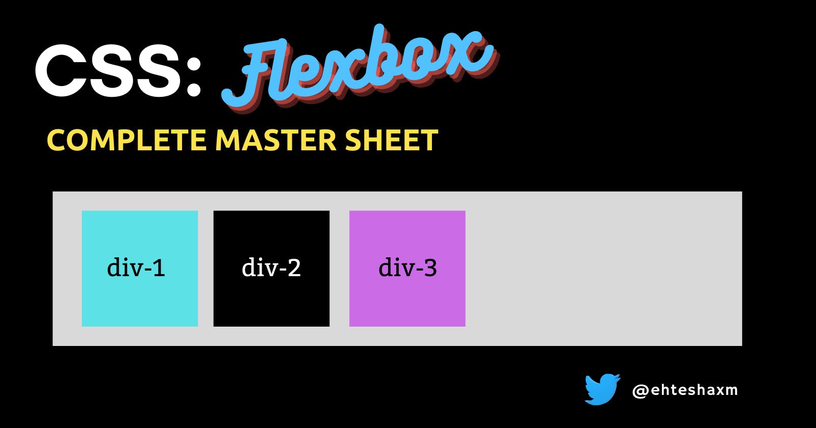


I was getting tired of some Flexbox properties not working the way I wanted them to, So thought of simplifying it for myself and others once and for all, Here we go ->
What is Flexbox?
Flexbox is a display property that aims at providing an easy and efficient way of laying out and aligning items in a container.
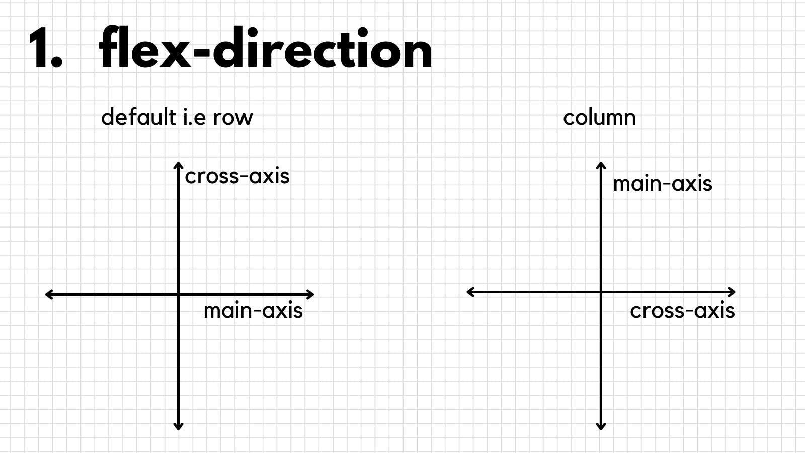
It works on the principle of axes, by default:
- Horizontal -> x-axis -> main-axis
- Vertical -> y-axis -> cross-axis
We can also change the orientation of the axes i.e. we can say,
the y-axis to be main and the x-axis to be cross
Let's see how with our first container property,
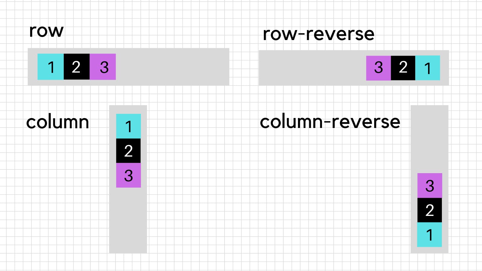
1. flex-direction
By default, set to row when set to the column it makes the y-axis main
It takes 4 values, Notice how row-reverse and column-reverse do not only reverse the order of the items but also reverse their starting position
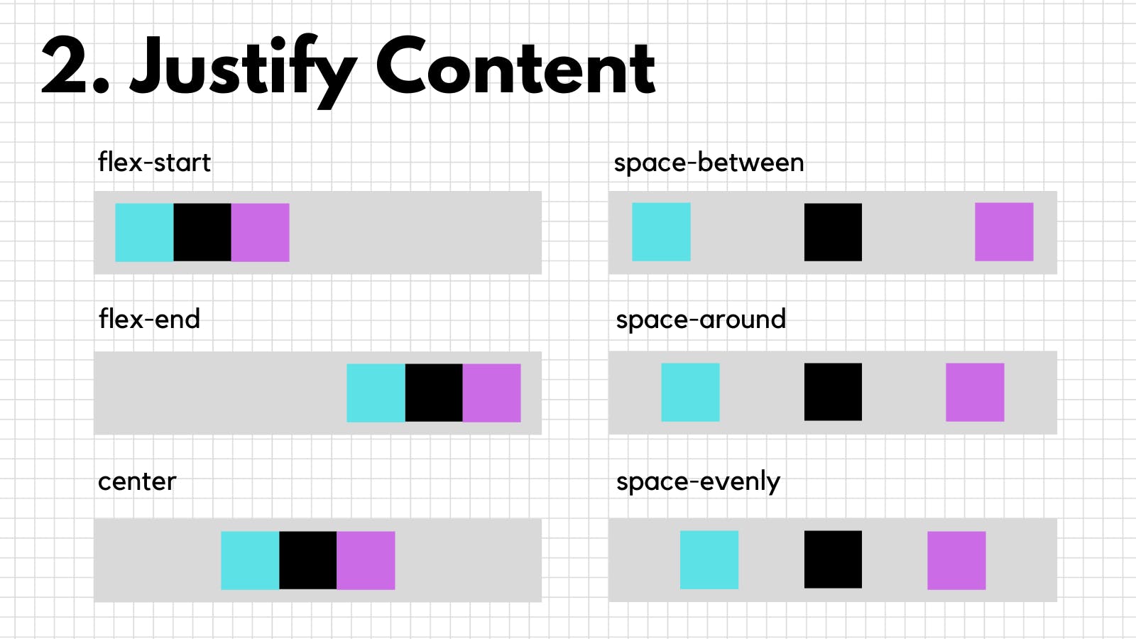
2. justify-content
It is the property used to align items on the main-axis whether it is y-axis or x-axis (we can make y-axis main with flex-direction)
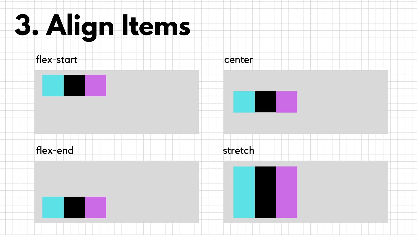
3. align-items
We just saw how to align items on the main-axis but what if we want to align items with respect to the cross-axis, Well, align-items can help, It is the property used to align items on the cross-axis.
By default, align-items is set to stretch so, If you were to declare a container flex and then increase the height of the container all flex-items would then stretch to fill the container
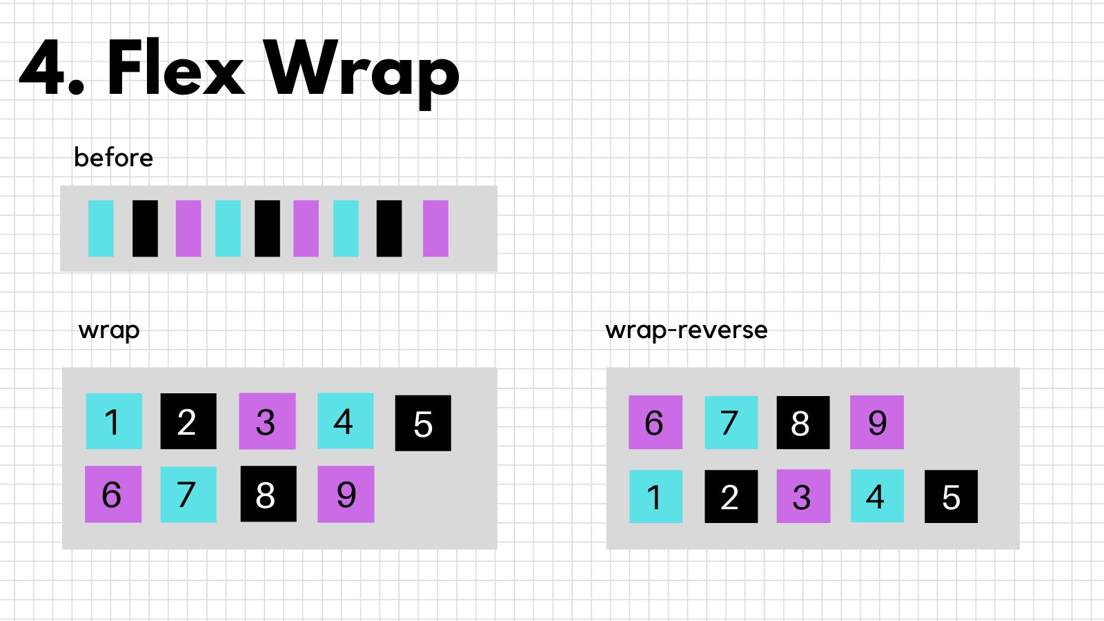
4. flex-wrap
If you have a flex container with many flex items with not enough space to fit all of the items then the items will shrink, But you can make each item take enough width and push the rest to another line with flex-wrap
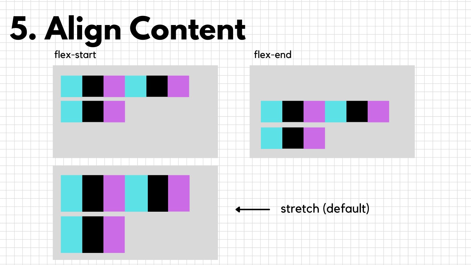
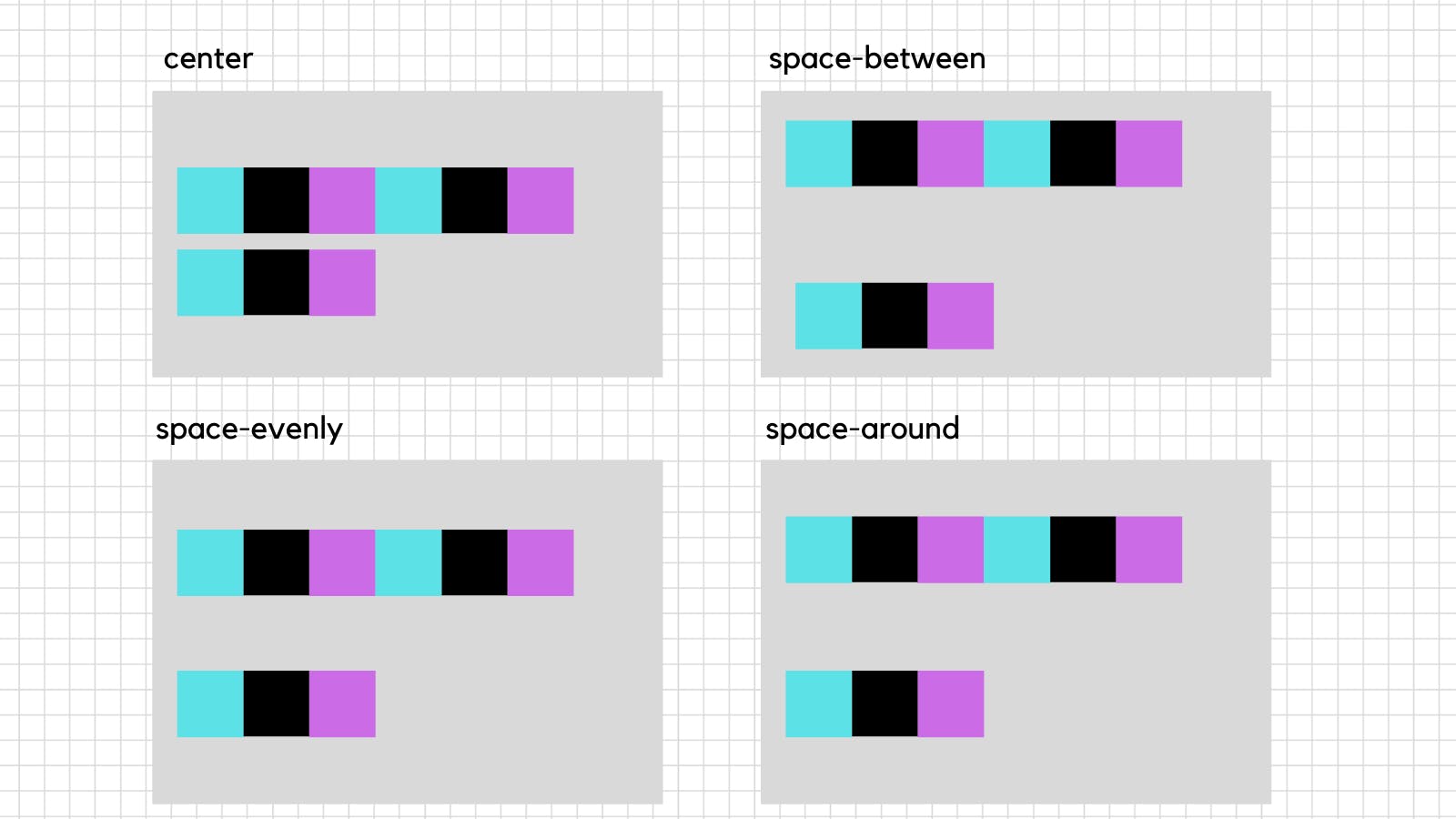
5. align-content
flex-wrap pushes the remaining items to the next line, now if you want to mess with the spacing between and around the those lines you can use align-content
All the properties we just saw were of the flex container (grey container in this case) now let's see the flex item properties (blue, black, purple containers in this case)
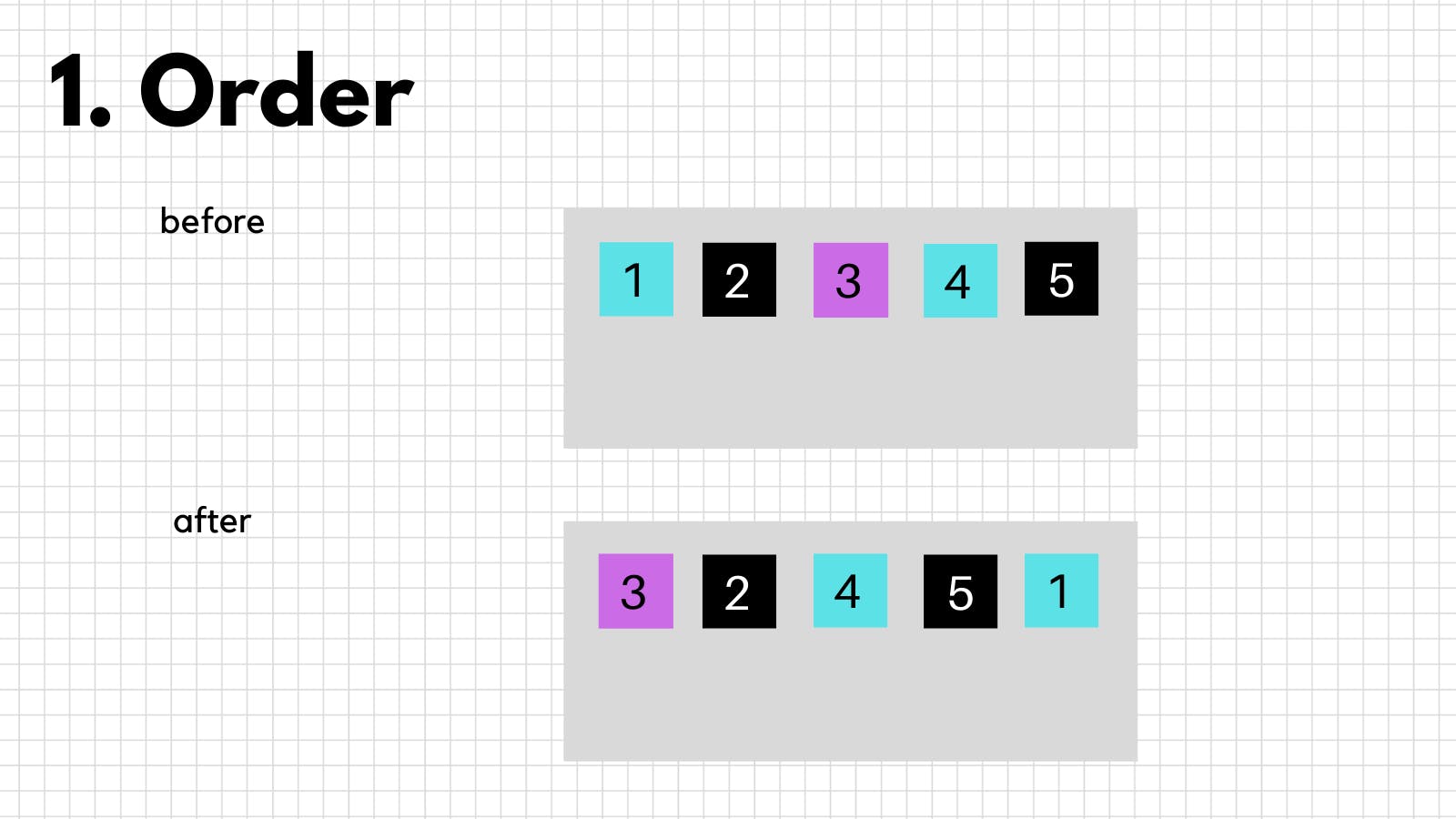
1. order
It is used to change the order of the flex items
<div style="display: flex">
  <div style="order: 5">1</div>
  <div style="order: 2">2</div>
  <div style="order: 1">3</div>
  <div style="order: 3">4</div>
  <div style="order: 4">5</div>
</div>
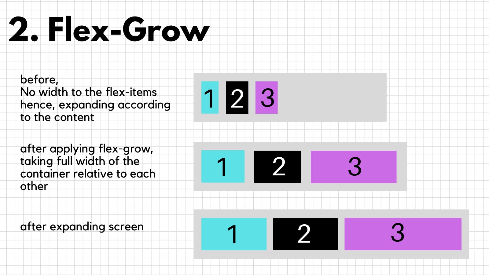
2. flex-grow
If you want your flex-items to grow with the viewport relative to each other then you can use flex-grow, flex-grow property makes flex-items collectively take the whole width of the container, relative to each other, corresponding to the values given to each item.
Here, the flex-grow property is set to (1 for 1,2) and (2 for 3)
item 3 will grow twice as fast compared to other items
You can also make an item not grow at all by setting
flex-grow to 0.
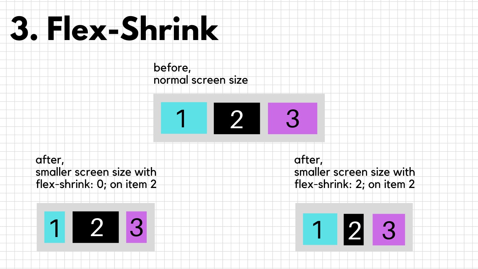
3. flex-shrink
All flex-items shrink automatically with the viewport but if you want some items to shrink faster or not shrink at all you can use flex-shrink,
flex-shrink 0 would not let the item shrink at all
flex-shrink: 2 would make the item shrink twice as fast compared to other items
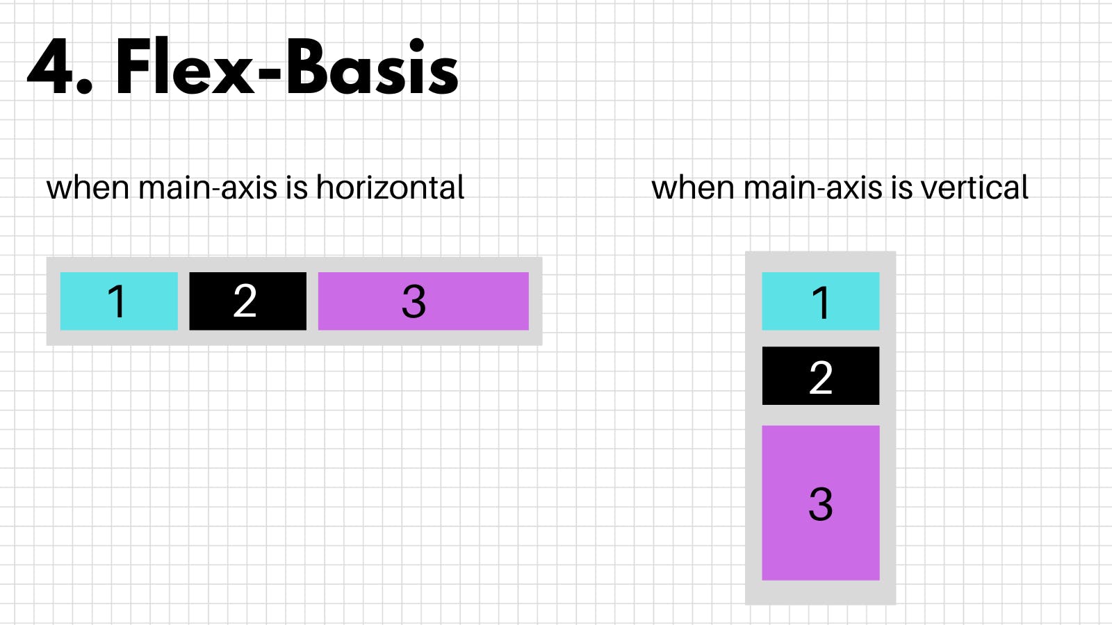
4. flex-basis
Sets the length of the item on the main-axis
here, setting flex-basis: 200px; on item 3
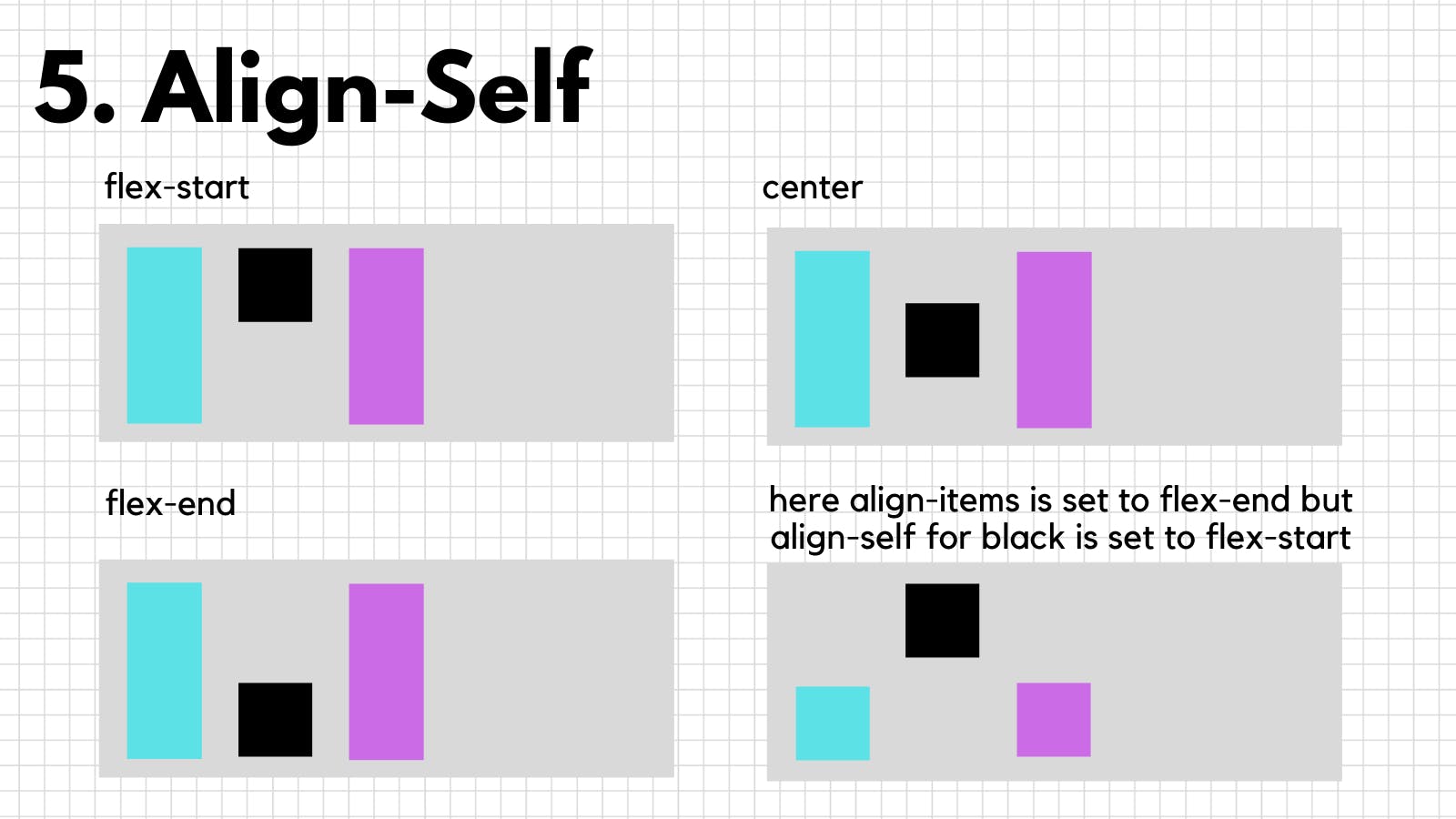
5. align-self
It is used to align an item, align-self overrides the align-items (container property) for that particular item
6. flex
To declare flex-grow, flex-shrink and flex-basis for an item in a single line you can use flex property
It takes 3 values,
x = flex-grow
y = flex-shrink
z = flex-basis
flex: x y z;
Well, this is it, kudos on making it this far, I hope you understood all the properties, Thank you for reading, Hit like if you liked it, Twitter DM doors are always open for suggestions